Evoke Emotions With Your Website Colors

When it comes to your website, first impressions are everything. Sure, there’s the age-old expression “don’t judge a book by its cover.” However, it’s difficult to get someone’s attention without catching their eye first!
As soon as customers land on your website, their brains automatically start to associate your site with specific emotions based on its use of colors. Below are a few popular colors, their common connotations, and how we implemented them appropriately into websites for our clients.
Red
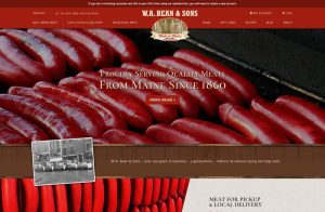
The most aggressive color, red often times communicates danger. It is the color of blood and stop signs. It is also associated with fire and feelings of hunger.
When to Use
Useful when designing a website for a food-related product. Such as this meat distribution business web design we created.
When to Avoid
If a large part of your business establishes a trusting, emotional connection with your clients (ie. medical services), versus selling a particular product.
Orange
Orange can be an effective alternative to red. While not as aggressive, orange is a robust color. People often associate it with strength and endurance.
When to Use
To draw attention to a particular object, as we did with the “Get a Free Estimate” button on our website design below.

When to Avoid
as the main color for your site, as it can come across too overpowering and detract from other aspects of your website
Green
Shades of green typically remind people of nature. They conjure a sense of growth and freshness. It is also the color of money. This color signals “Go” on a traffic light.
When to Use
Ideal for nature-based or restorative products and services, like gardening or skincare products.
When to Avoid
If your business isn’t focused on nature or feelings of renewal.
Blue
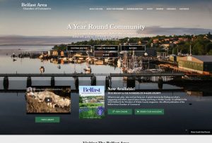
Blue is used frequently in web designs because of its ability to evoke feelings of trust, relaxation, comfort, and loyalty.
When to Use
Implement shades of blue to establish a solid rapport with your clients, like this website we designed for the Belfast Area Chamber of Commerce.
When to Avoid
Blue is a versatile color that can be implemented into any website design.
Black
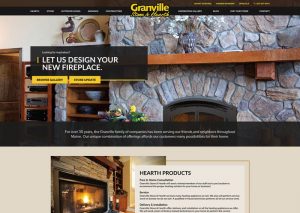
In the past, people associated black with darkness or evil. In more recent times, it evolved into an indicator of luxury, elegance, formality, and strength.
When to Use
Helpful if you want to establish yourself in a luxury market, such as a pricey hotel or fancy watch collection. In the example below, we helped communicate the value of stone and hearth products.
When to Avoid
When trying to promote a product or service that you don’t want to be exclusive to a higher-end market.
Choosing your website colors plays a key role in achieving your business goals. When you meet with your web design agency to discuss the creation of your website, don’t be afraid to communicate which colors you like.
Be open to constructive feedback. Often, even if a specific hue may not work for the main site color, a web designer can still find a way to incorporate it.
———————————————
Links Web Design is a Website Design Company in Bangor, Maine.